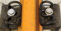
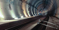
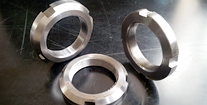
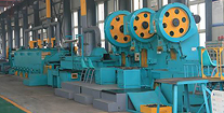
With HTTP/2, Service Workers, Responsive Images, Flexbox, SVG, WAI-ARIA roles and Font Loading API now available in browsers, we all are still trying to figure out just the right strategy for designing and buildings responsive websites efficiently. We want to use all of these technologies and smart processes like atomic design, but how can we use them efficiently, and how do we achieve it within a reasonable amount of time?
In this Masterclass, Vitaly Friedman, editor-in-chief of Smashing Magazine, will be looking into a strategy for crafting fast, resilient and flexible responsive design systems by utilizing all of those wonderful shiny web technologies we have available today. We'll also talk about dealing with legacy browsers and will cover a few dirty little techniques that might ensure that your responsive websites will stay relevant, flexible and accessible in the years to come. Beware: you won’t be able to unlearn the things that you’ll learn in the workshop!
Tickets are sold in two batches of 15 tickets, to accomodate participants that are not on CEST:
More information
Date: Friday June 9th
Time: 08:30 - 15:00
Room: Stjerneskibet
Available seats: 30
Price: €200 / seat
Only available for Codegarden ticket-owners
Sale starts April 18th